Rimz
Skincare · Brand Identity
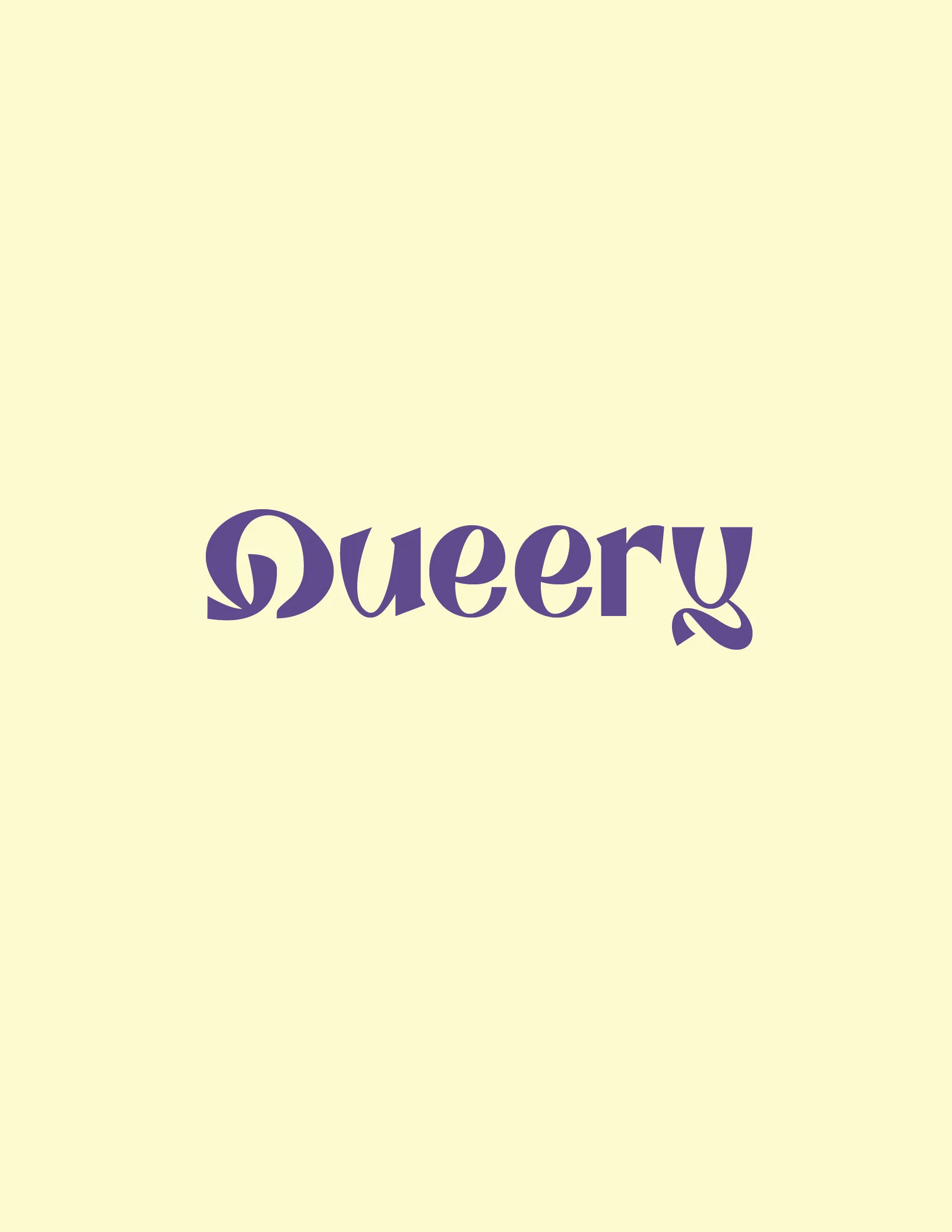
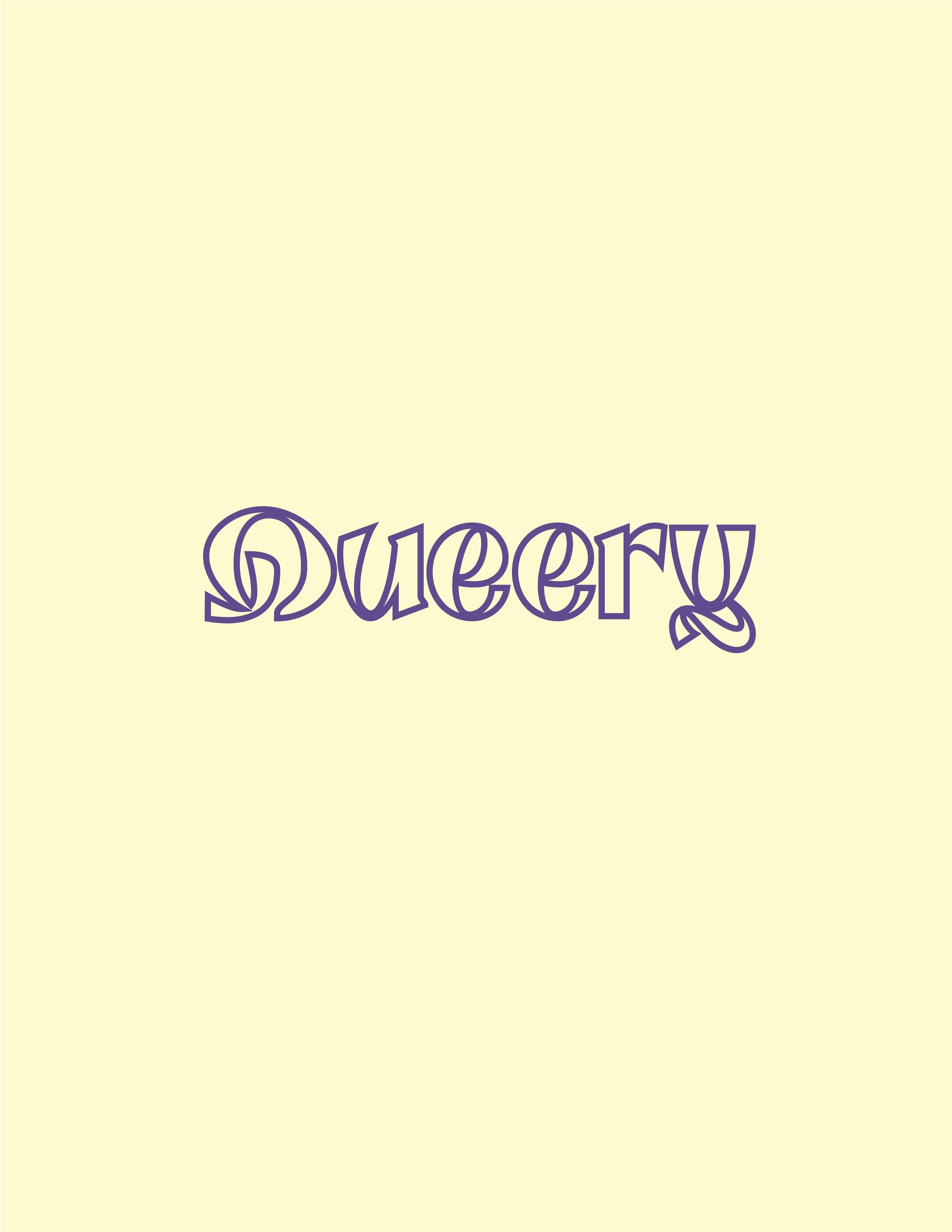
Queery
Dating App · Brand Identity
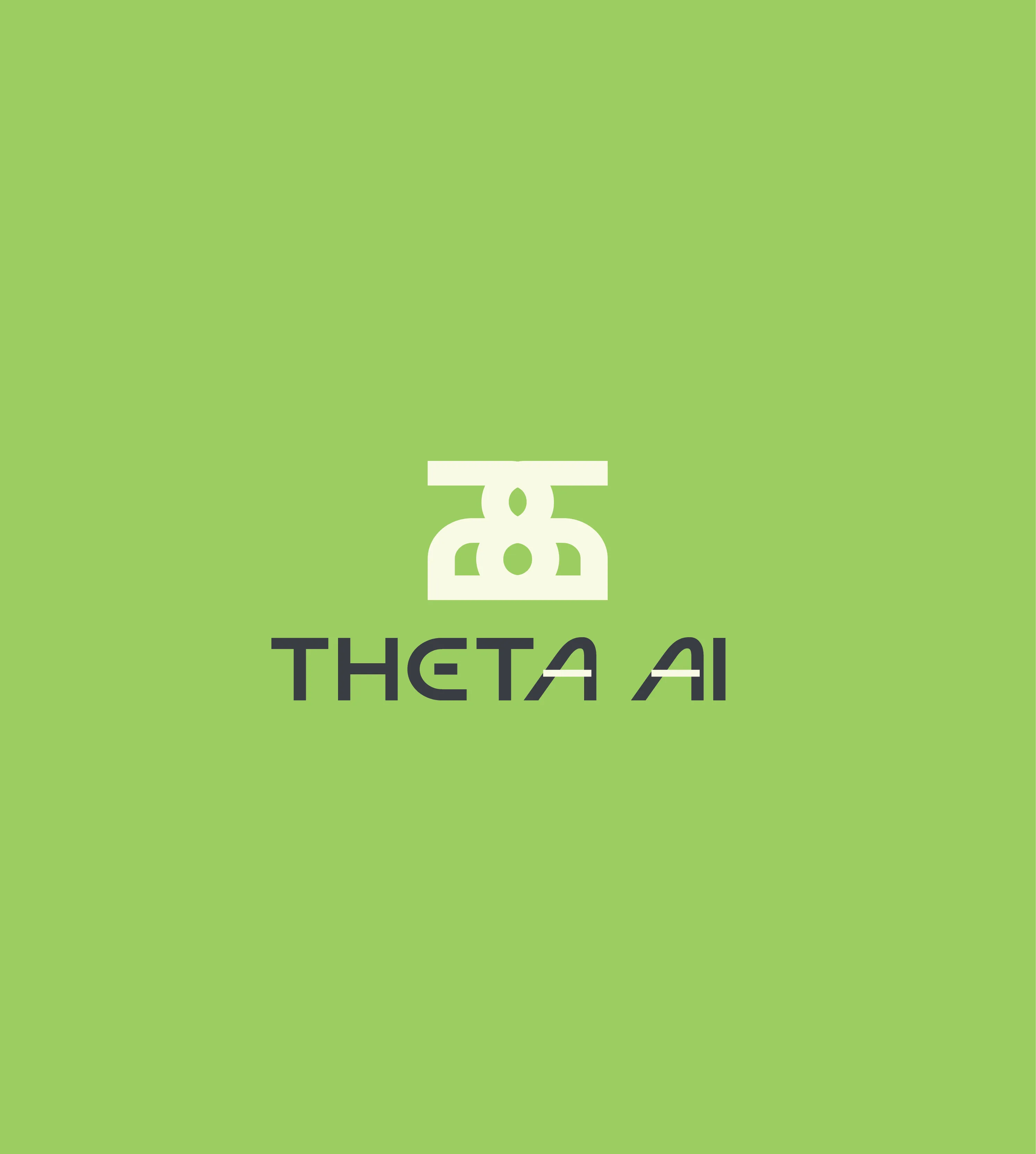
Theta
AI · Brand Identity
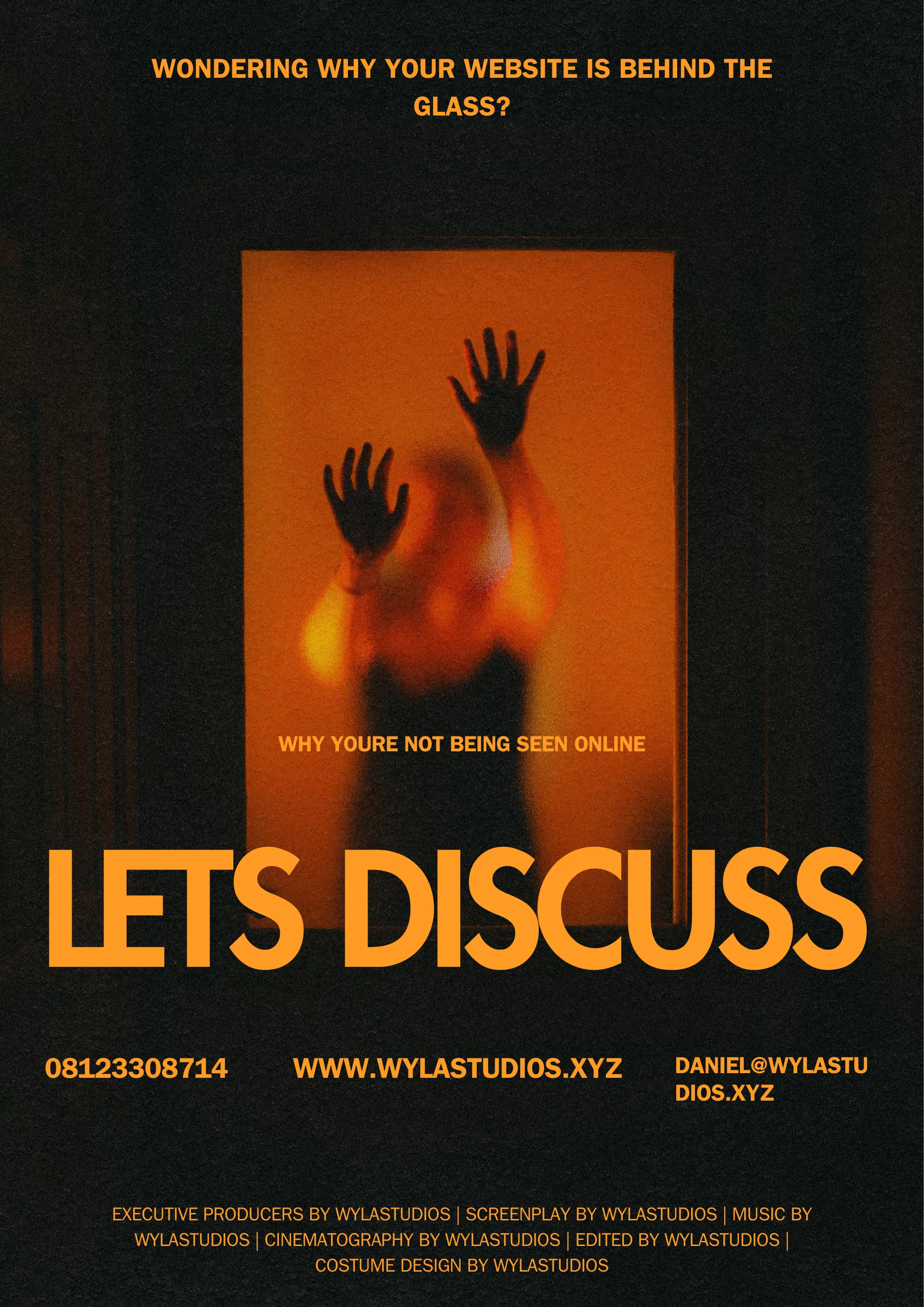
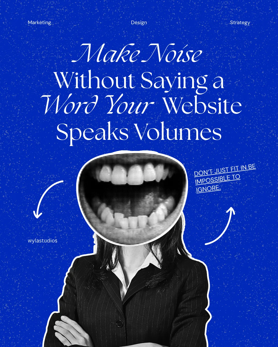
Wyla Studios
Agency · Web Dev
Brand Promo
Video · Motion

Designer first. Developer when needed. Based in Lagos, Nigeria and obsessed with the gap between how things look and how they make people feel. I got into code because Figma files don't ship themselves.
I design brands that don't look like everyone else's. Build websites that don't feel like templates. Make videos people actually finish watching. If it needs to look good and work properly, that's the job.
Senior Web Designer at Wyla Studios (2025 to now)
Network Operations Intern at Tizeti Limited (2024)
Intern at Lagos State Ministry of Science & Tech (2022)
B.Sc Computer Science at Caleb University (2023)
UI Design Certificate at CalArts (2023)
Lagos based. Available for freelance and full-time opportunities.
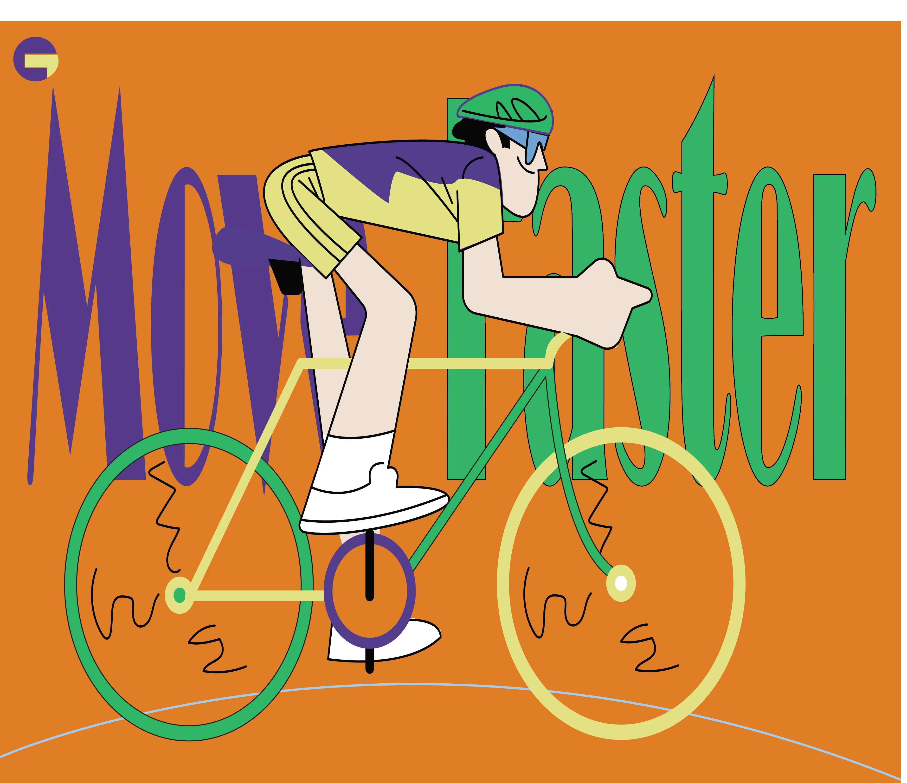
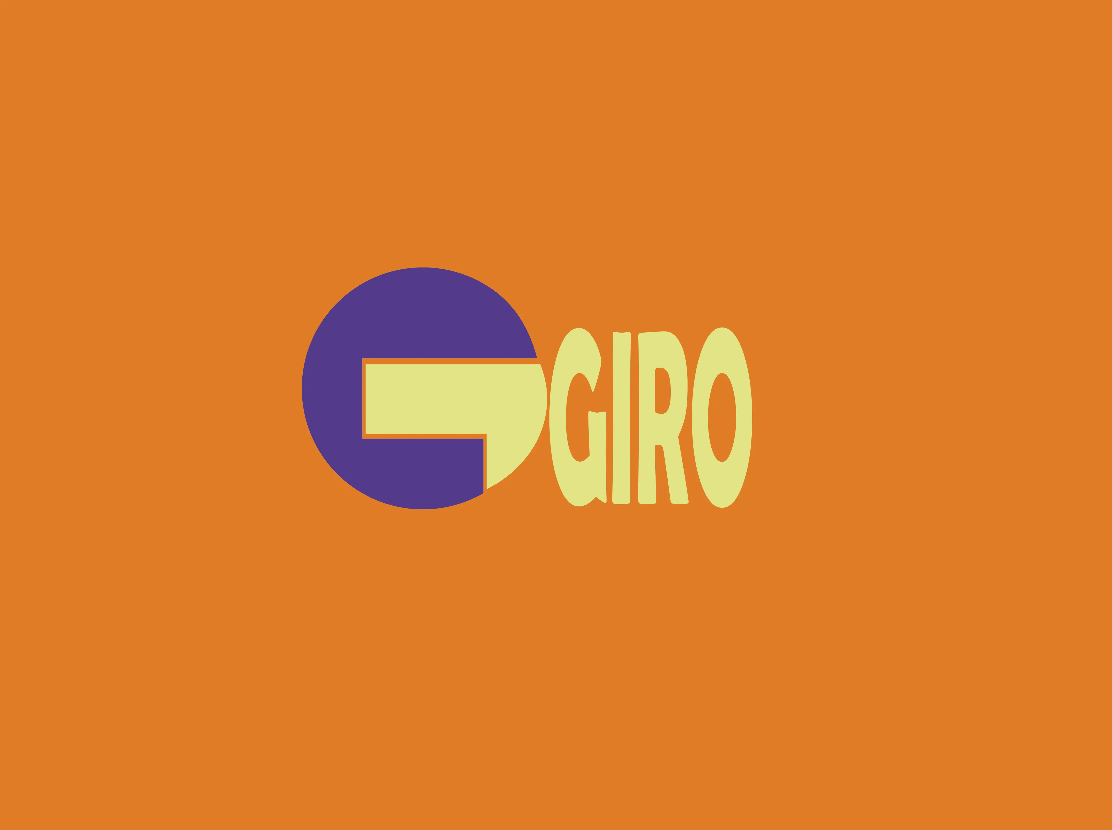
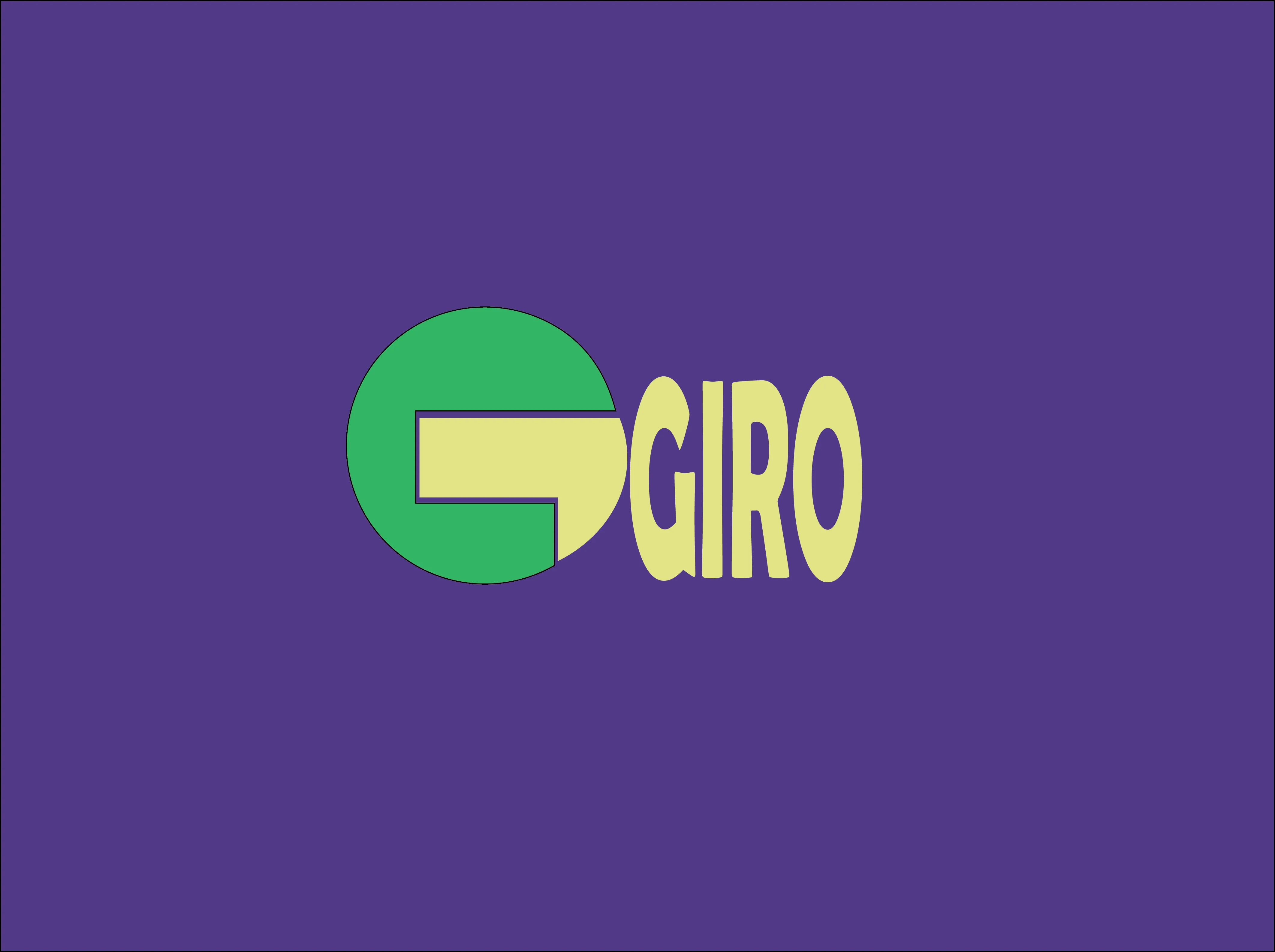
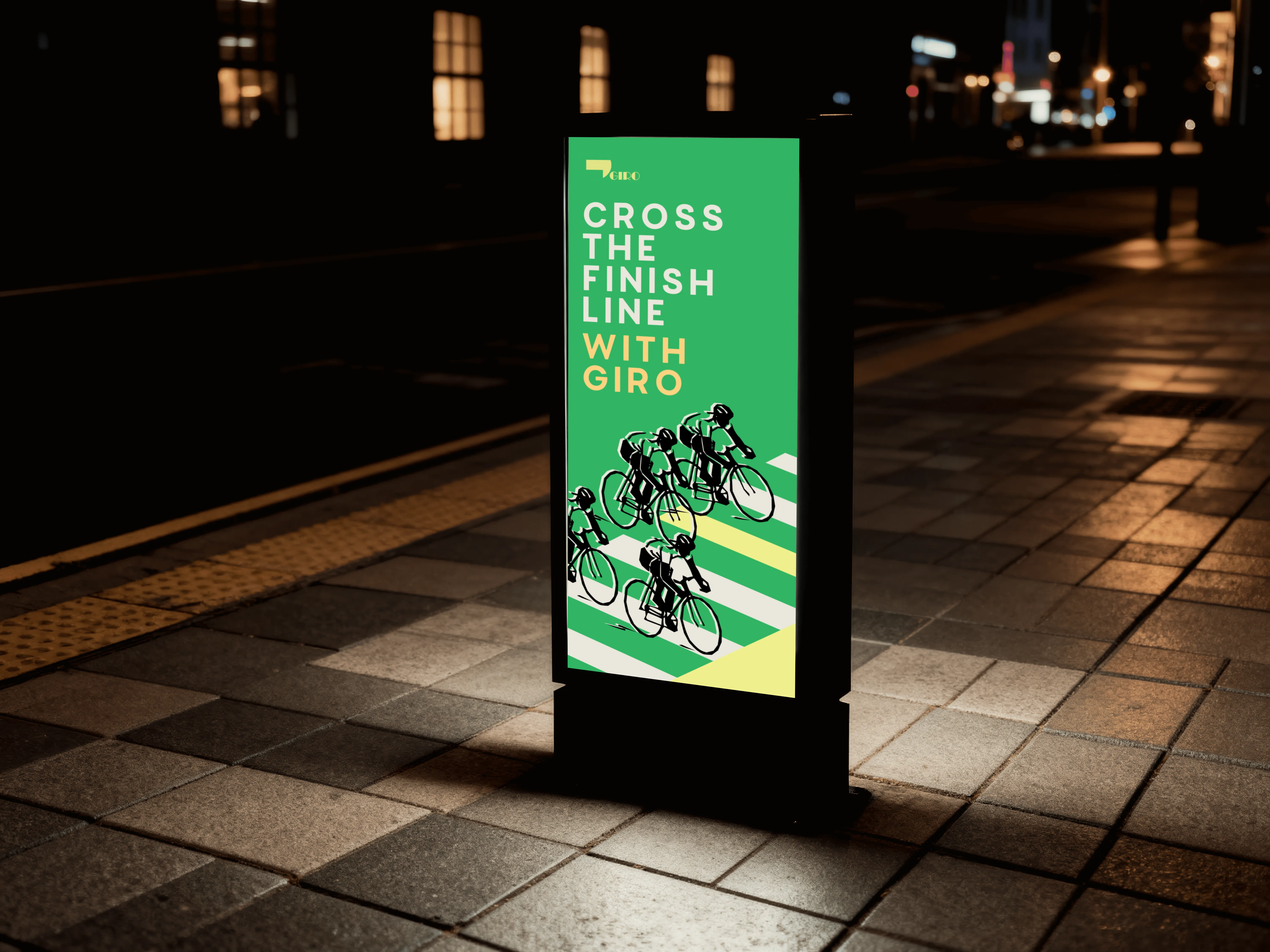
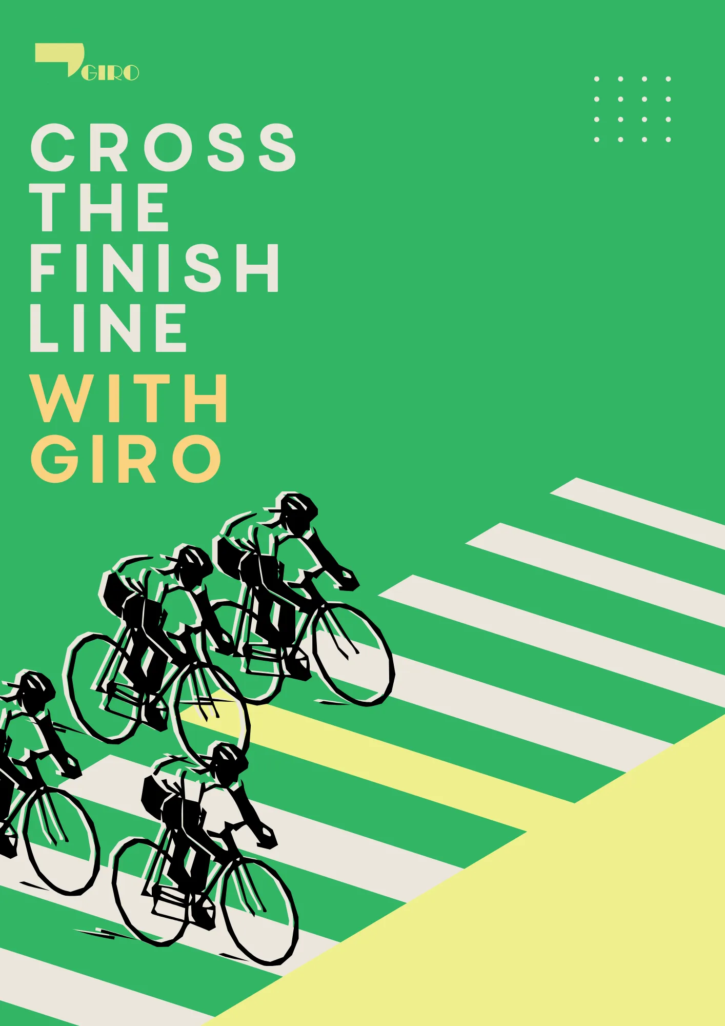
Cycling Company Logo & Brand Patterns
Overview
Giro is a cycling company built around speed, endurance, and the culture of the road. The brief was to develop a brand identity and set of patterns that could live across kit, merchandise, and digital — something athletic without being generic.
The Brief
Giro needed a visual language beyond the logo. Repeatable patterns for cycling jerseys, packaging, and brand touchpoints that feel cohesive and premium.
The Approach
Drew from cycling motion. Wheel geometry, velocity lines, and cadence rhythm. Each pattern is modular, scales cleanly from jersey print to digital banner.
Design Note
"Every pattern has to earn its place on a jersey. It needs to look good at speed, in motion, and under pressure."

Client
Giro Cycling
Deliverable
Logo & Brand Pattern System
Year
2025
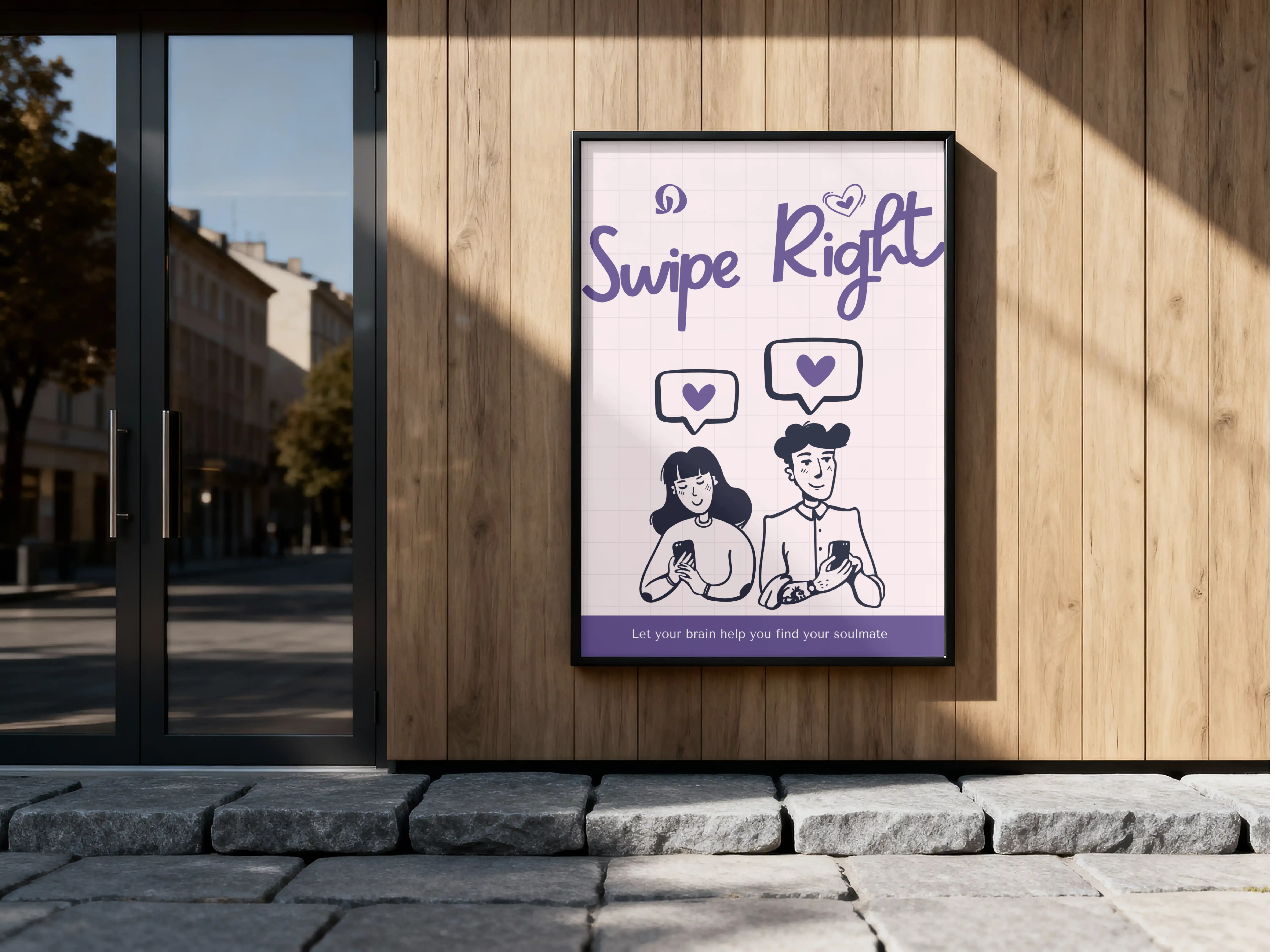
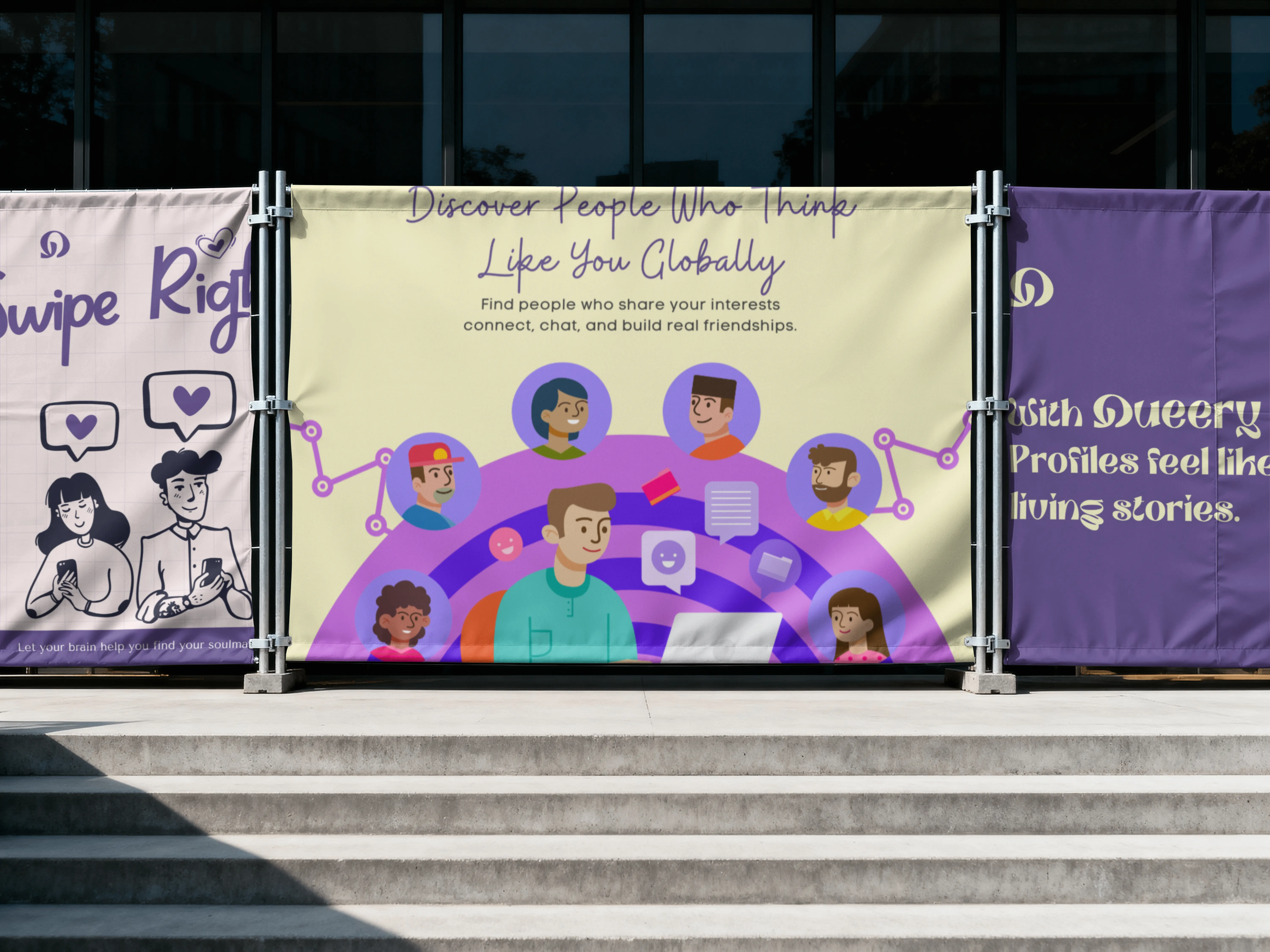
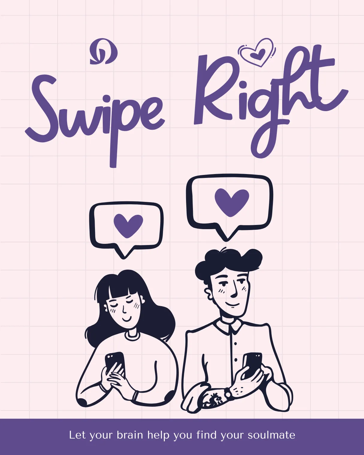
Dating App Logo & Brand Identity
Overview
Queery is a dating app built for people who want connection that feels real, not algorithmic. The brand needed to feel warm, modern and distinct in a space full of red hearts and generic gradients.
The Brief
Build a brand identity from zero. Logo, colour system, typography and a visual language that could scale across app UI, social and marketing materials.
The Approach
Designed around the idea of a question mark as connection. Soft but confident. A palette that feels human without being generic. Built to stand out in the App Store.
Design Note
"Dating apps all look the same. Queery needed to feel like it was built by someone who actually understands people."
Client
Queery
Deliverable
Logo & Brand Identity
Year
2025
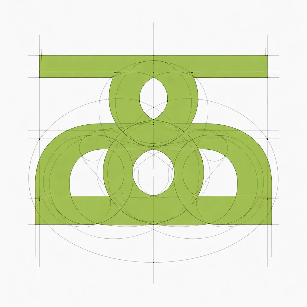
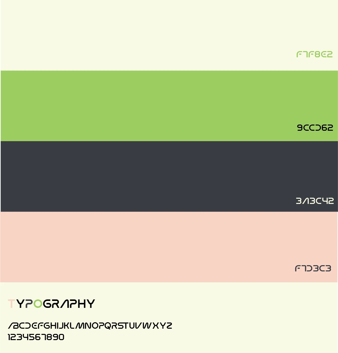
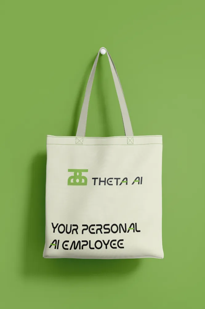
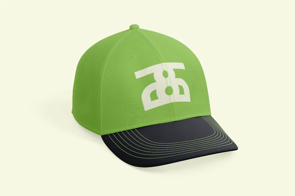
AI Employee Logo & Brand Identity
Overview
Theta is an AI employee platform. Businesses deploy Theta to handle tasks, workflows and communication autonomously. The brand needed to feel intelligent and trustworthy without the cold, robotic aesthetic that AI products usually default to.
The Brief
Create a brand identity that positions Theta as a serious enterprise product. Logo, colour system and visual language that works across product UI, pitch decks and marketing.
The Approach
Used the Greek letter as a foundation. Precision and intelligence without arrogance. A system that feels built for boardrooms but accessible enough for any team.
Design Note
"AI products all look sterile. Theta needed to feel like a colleague, not a machine."
Client
Theta
Deliverable
Logo & Brand Identity
Year
2025
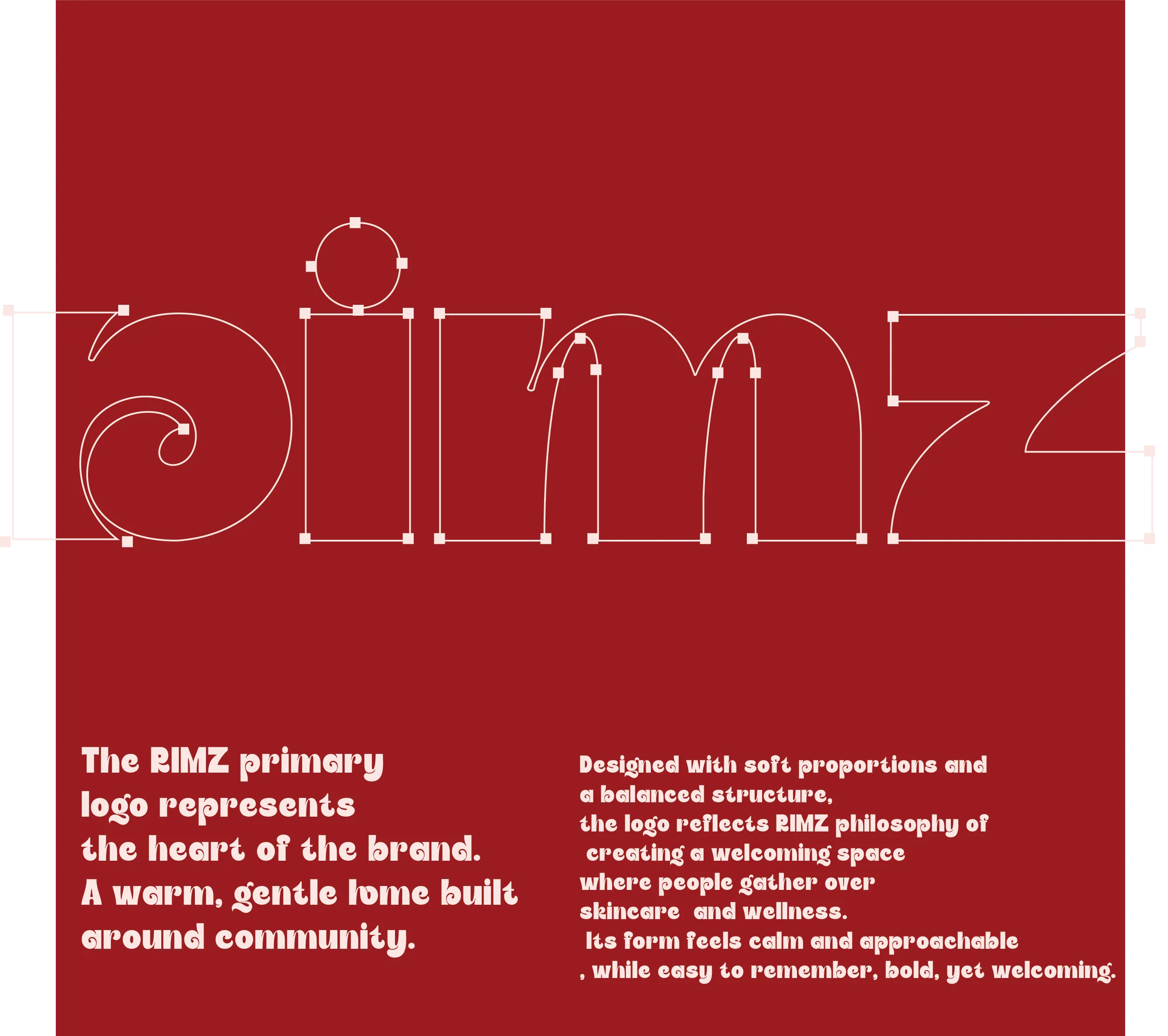
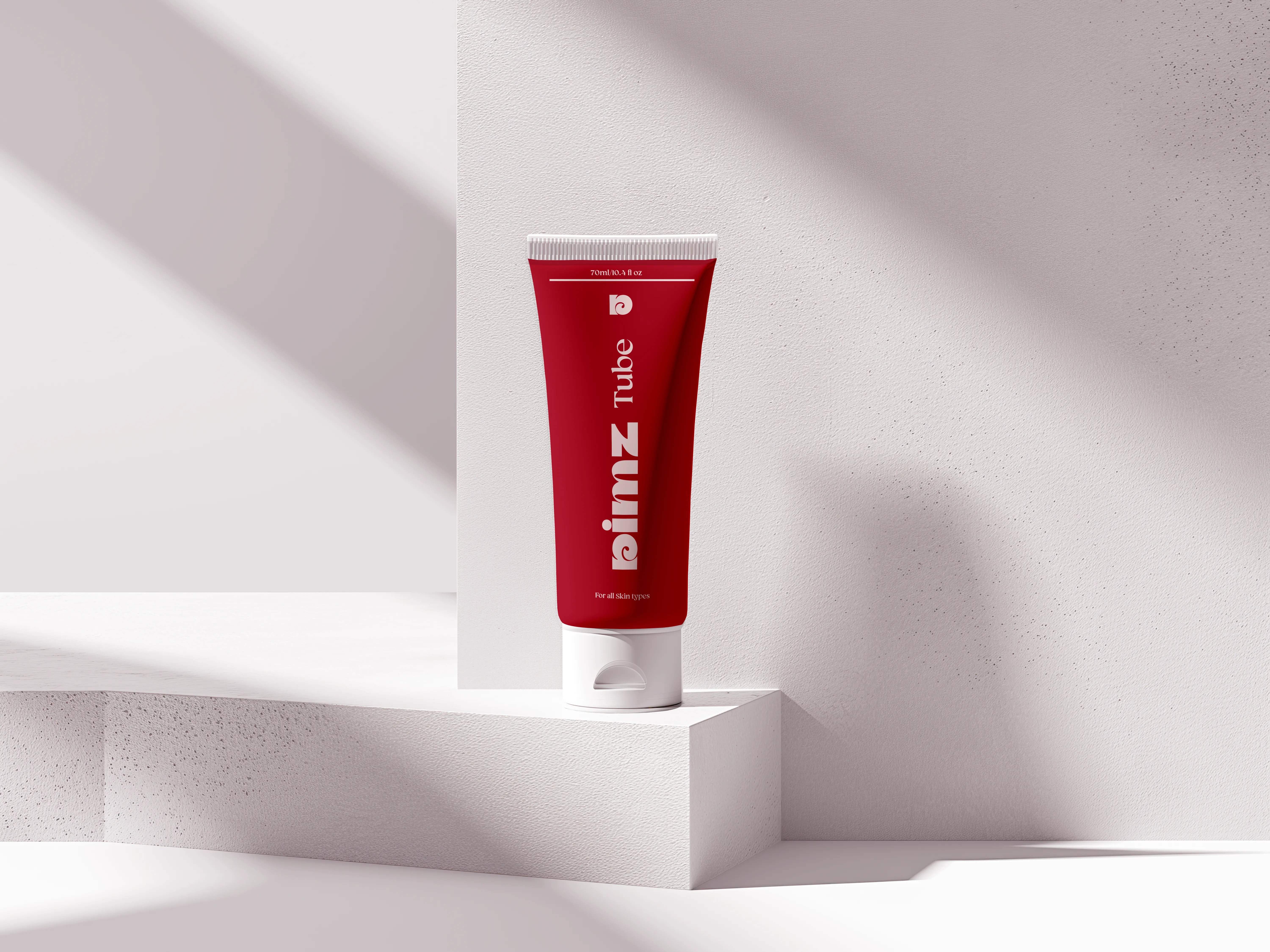
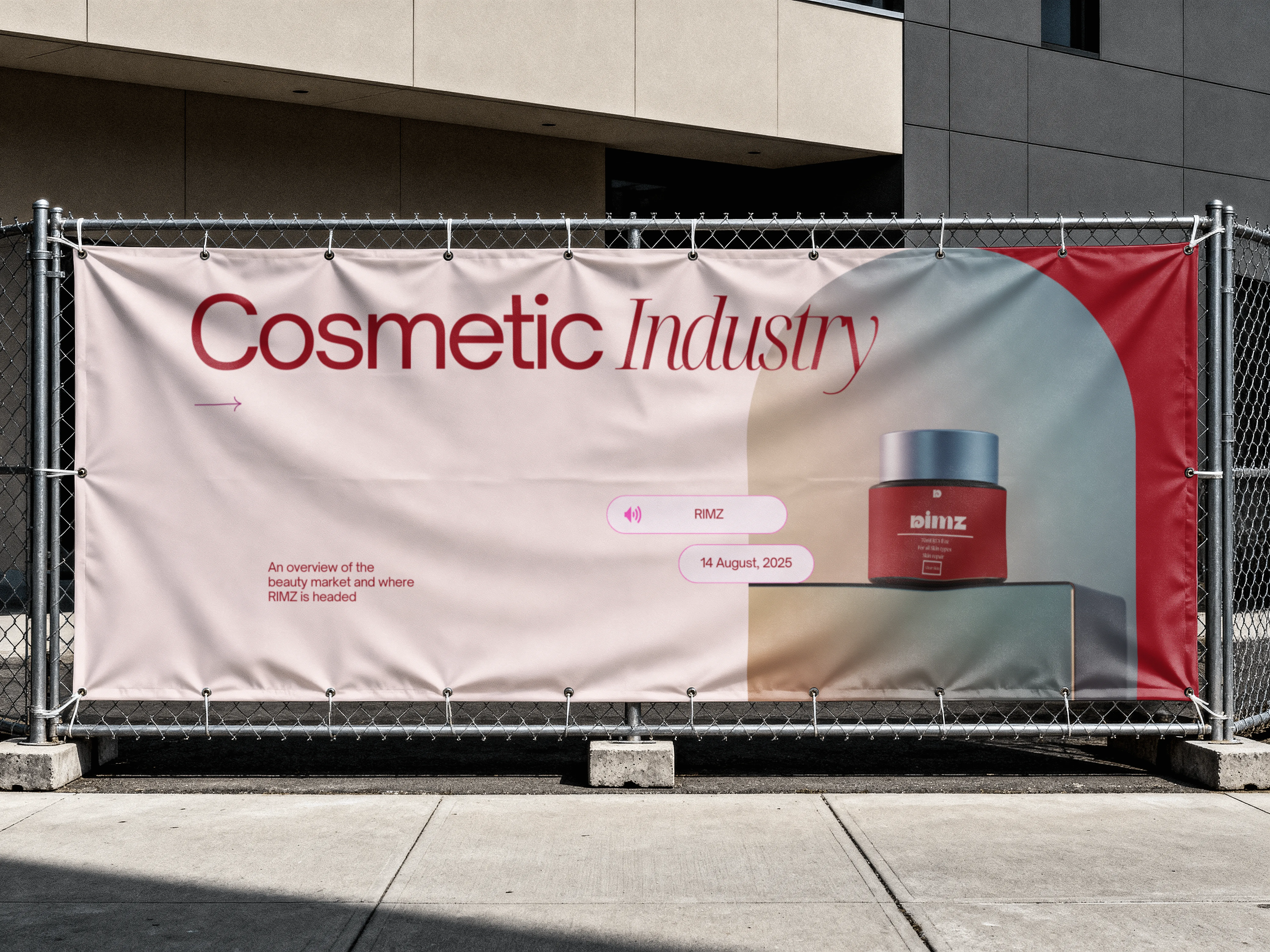
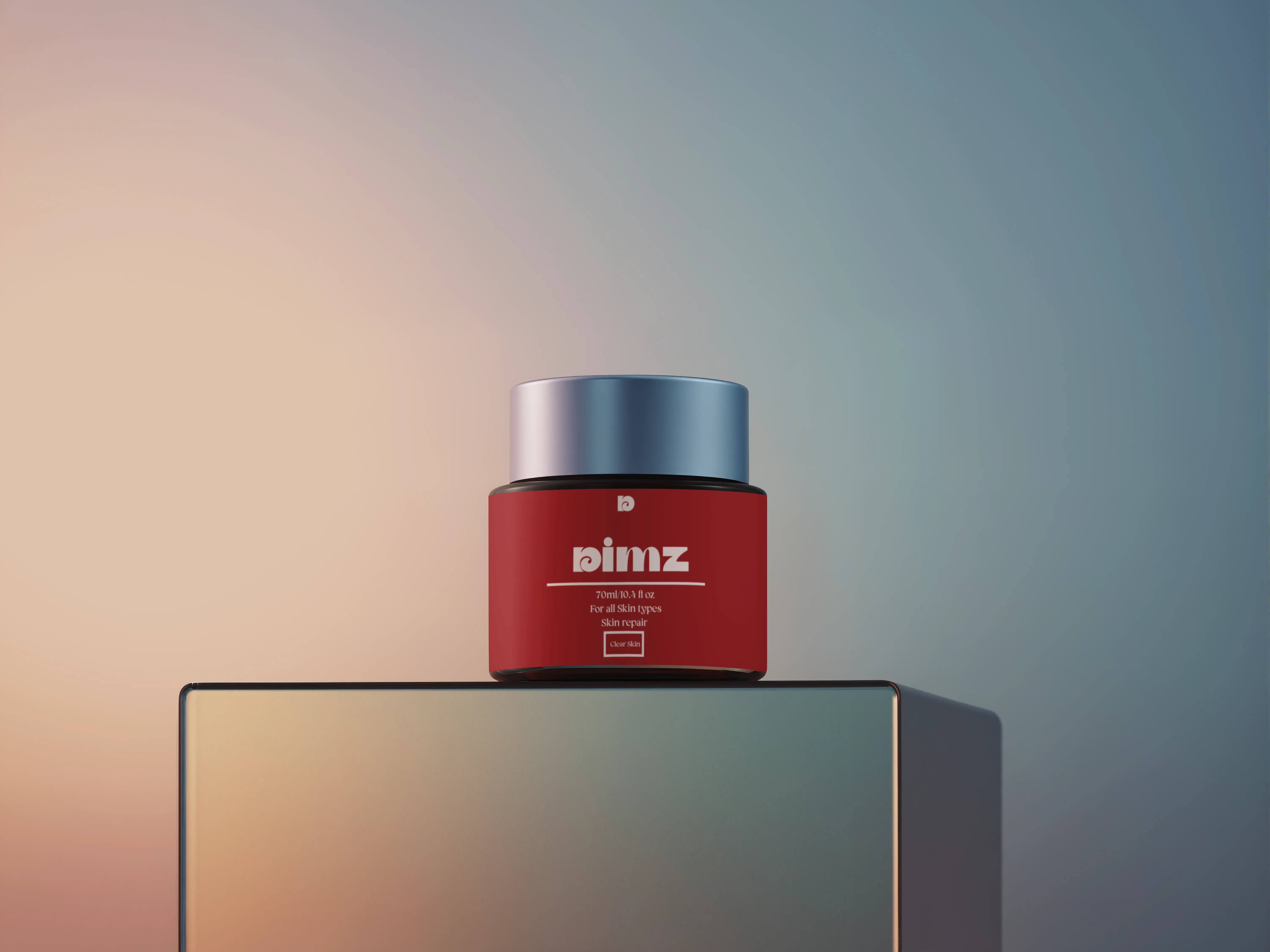
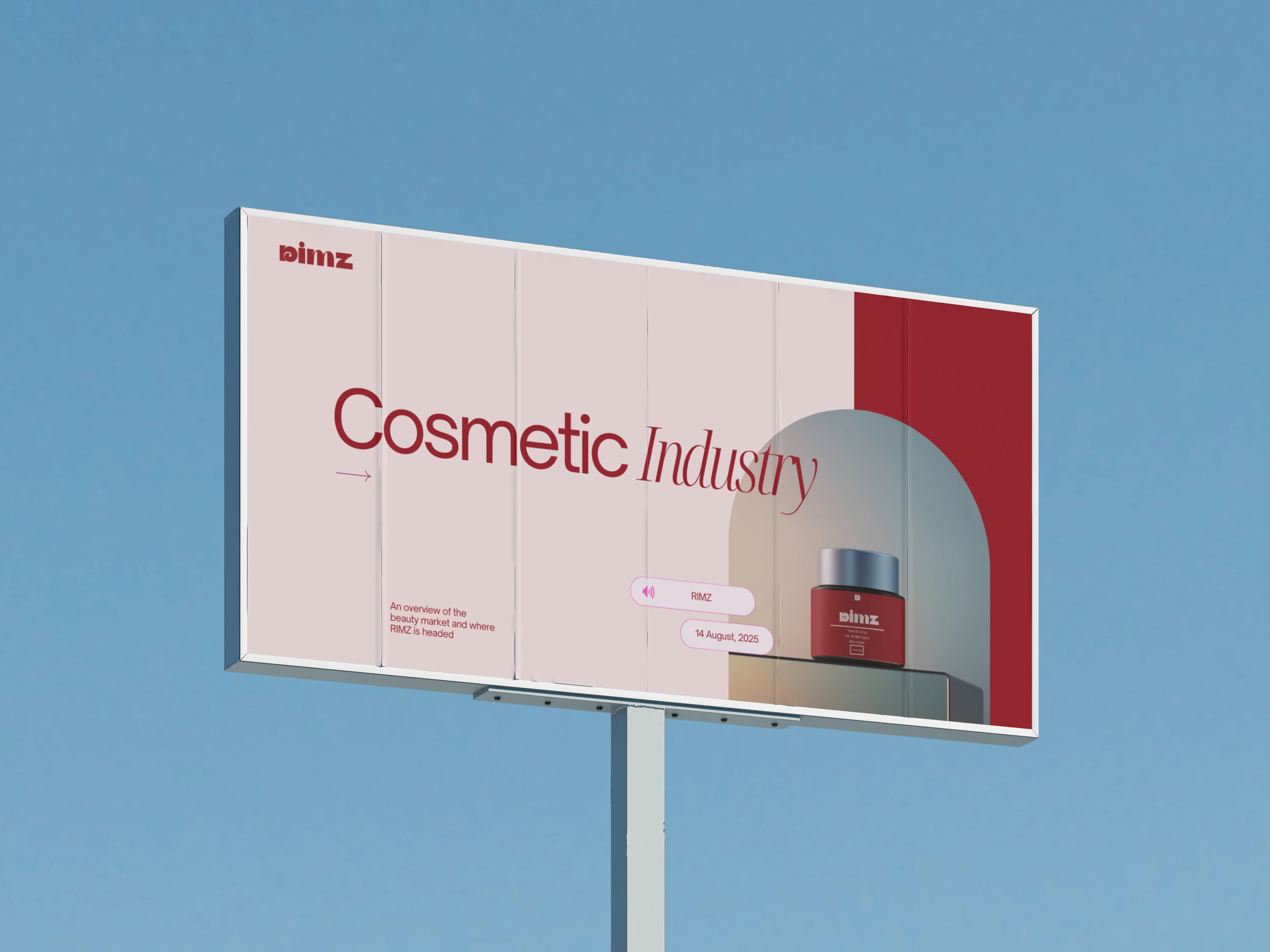
Skincare Brand Logo & Identity
Overview
Rimz is a skincare brand built around clarity, confidence and clean formulations. The brief was to build a brand identity that feels premium without being cold — something that connects with people who take their skin seriously.
The Brief
Rimz needed a full brand identity from scratch. Logo, colour system, typography and a visual language that works across packaging, social and digital touchpoints.
The Approach
Led with simplicity and elegance. Clean type, a restrained palette and considered spacing. Every element earns its place — nothing decorative for decoration's sake.

Design Note
"Skincare brands either look clinical or overcrowded. Rimz needed to look like it belongs on a shelf next to the best."
Client
Rimz
Deliverable
Logo & Brand Identity
Year
2025